Absolute Blog / Digital

  • Posted 15/02/2024 by absolute

    Making Your Website Stand Out in 2024

    The web design industry is constantly evolving and 2024 will be no exception. With new technologies, user preferences, and design standards, web designers are embracing the latest trends and best practices to create websites that are engaging, functional, and attractive. Here, we explore some of the web design trends that we expect to dominate, and how Absolute Media Brisbane can help you implement them on your website.

    1. Full-Screen Homepage Hero Section

    Full-screen hero sections act like a huge billboard for your website. They immediately capture user attention and deliver a clear communication with few distractions.

    A full-screen hero section is a great way to position your business, and to set the scene for your business, brand or product. You of course need an image with meaningful content that adapts to different browser sizes and so avoids being cropped in a way that ruins the design.

    Don't worry about putting your content ‘above the fold’. The idea that users won't scroll down to see more information is outdated, as most users are used to scrolling on their devices.

    2. Graphics with Photos
    You will doubtless have seen images on social media that include graphic overlays. This technique adds creativity, depth and relevance to otherwise regular images. Combining photos with graphics can enhance your brand identity, helps to visually connect your content, and has the added bonus of keeps your website visitors interested in your content, plus done correctly, making it memorable.

    3. Responsive Design

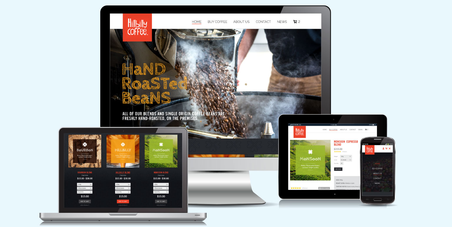
    Not a new trend, but still a crucial one. Responsive design means that your website adapts to different screen sizes and devices, ensuring consistent and optimal user experience across all platforms. Responsive design is not only important for usability, but also for SEO; Google favours websites that are mobile-friendly and perform well on smartphones and tablets. Absolute Media can help you create a responsive website that looks great and performs well on any device.

    4. Dark Mode

    Dark mode is a popular option for many users who prefer a darker background for their websites and apps. Dark mode helps reduce eye strain, save battery life, and create a sleek and modern aesthetic. Dark mode can also make your website stand out from the crowd, as many websites still use light backgrounds. Absolute Media can help you design a website that offers dark mode as an option for your visitors, or even as the default theme.

    5. Less is More - the Art of Minimalism

    Minimalism is a design trend that’s been around for decades but, in the communications industry, it is still very relevant and effective. Minimalism is the art of using less to achieve more. By eliminating unnecessary elements and focusing on the essential ones, minimalism can make your website look clean, elegant, and professional, as well as improve its loading speed and usability. We can help you create a minimalist website that showcases your content and brand without any distractions.

    6. Micro-Interactions

    On websites, small animations help to provide subtle feedback to your visitors. A good example of this is when a button changes colour when the user hovers their mouse over it. Focussing on these points of micro-interaction on your website, helps bring attention to the details that you ideally want visitors to focus on, and engage. Things like subtle movement, slowly shifting gradients, scrolling animations and parallax, or changes to the mouse icon when you click an element are all possible instances where micro-interaction can be used to great effect.

    7. Micro-Animations

    Micro animations are extremely useful for holding attention, and guiding users to key aspects of your website. Thinking about how content moves, when loading, when scrolling or swiping, when hovering can bring really effective enhancement to your user experience and present more dynamic qualities, if that’s your thing.

    8. Dynamic Cursors

    Customizing how users interact with your web elements with the cursor is both a cool and creative way to enhance your users’ experience. Changes the shape of a cursor, it’s colour and how it behaves when key events are triggered works as an effective and albeit sometimes slightly distracting technique which has gained popularity recently.

    9. Interactive Content

    Interactivity on your website is a great way to get your visitors engage, to pull them deeper into your content, and for your business to find out more about them.

    The moment that a visitor starts interacting with your site content, their experience shifts from passive to active, and the conversion experience begins. Think of things that can help your prospects to make informed decisions, and deploy content like interactive event calendars, estimate calculators, animated infographics, questionnaires, resource libraries, maps and survey results to increase the likelihood of generating more new enquiries.

    10. Custom Illustrations

    Illustrations are an obvious way to make your website more unique and memorable. Illustrated custom-made graphics can also reinforce your brand personality, message, and tone in a creative and engaging way. Illustrations can also bring colour and qualities such as humour and emotion to your website, making it more appealing and relatable to your audience.

    These are just some of the web design trends that we expect to dominate, but there are many more to explore and experiment with. If you want to make your website stand out this year, Absolute Media Brisbane can help you with all your web design needs. Contact us today for a free consultation and quote.

  • Posted 03/05/2019 by absolute

    From the Little things

    digital marketing agency new client announcement

    Absolute Media is proud to welcome our latest new client, Little Estate Lawyers.

    Whilst not exactly a hot-off-the-press news scoop (we were originally approached late in 2018), they are yet another great example of a client who originally approached us for a specific solution, then realised the invaluable benefits our rounded marketing experience in helping to establish their new small business, and are now been able to rely on us for additional marketing services.

    Headquartered in Brisbane, Little Estate Lawyers are specialist Wills and Estates Lawyers. They operate across Queensland and New South Wales, focusing on the provision of exceptional, straightforward legal advice and no hidden costs to clients in Brisbane, the Gold Coast and Sydney.

    With a successful legal career which started in 1997, owner Danielle Little worked for almost a decade for a large multi-national firm in litigation and estate matters before specialising in the area of Succession Law. She recently decided to start her own business and during that time chose Absolute Media ahead of numerous other digital marketing agencies to develop her new website design.

    New business start-ups are often cost-conscious exercises and this one was no different. Working to a tight budget and with the brief to extend Little Lawyer’s new business brand into the digital world, both parties agreed that the new website design needed to make a strong impact, to become a point of difference from potential competing business websites.

    Using a strong, classic black, white and gold colour scheme and some of the classic typographic qualities of ITC’s Avant Garde Gothic font collection, we developed a strong, single page layout and user interface design with the plan to include subtle animation and movement to the live version.

    Absolute also catered to the fact that the site would inevitably extend in scope and content as Little Lawyers growth began to develop.

    Danielle’s new logo design process with another agency hadn’t gone quite as smoothly as expected, so additional consultation was requested from us on how to address various issues and to ensure that the Little Lawyers logo and brand was both consistently represented and positively extended, to enhance the existing materials and maximise first impressions.

    Just six months in and with their second office already open, Absolute have recently been appointed to also handle their Search Engine Optimisation requirements in Queensland and New South Wales.

    As the song goes, ‘From the little things, big things grow’. Little Lawyer’s ability to call upon Absolute Media’s broad range of small business marketing services and experience as they develop a name for themselves is a great example of how important it is to partner with a company who take the time to understand your business, and can help you to take it to the next level at every stage.

  • Posted 05/04/2019 by absolute

    Peak Performing Referrals

    peak performance seo brisbane

    Since opening our doors to Brisbane in 2005 we have always had a healthy proportion of clients pointed in our direction.

    And we are pleased to welcome two more. The new start-up ‘A Happier Life’ and the longstanding ‘Moorooka Sports & Community Club’ have recently joined Absolute Media’s client roster. Both businesses were referred to us for our hugely competitive and very effective Search Engine Optimisation (SEO) capabilities.

    A Happier Life is a hypnosis service owned and operated by former Australian test cricketer Gary Cosier. By utilising Psychotherapy and Hypnosis Brisbane clients can benefit from their range of traditional solutions to help them quit smoking and lose weight, through to more forward-thinking areas such as life coaching and peak sports performance.

    Mookrooka Sports is a traditional bowling club that has undergone subtle modernisation in recent years. This has seen the extension of the club’s facilities to include a new bistro, and to offer its facilities as venues for weddings, social functions and business. Additionally, to appeal to the very popular demand for barefoot bowls in Brisbane food trucks now regularly rock-up to serve hungry punters and craft beers have been introduced to the bar.

    Absolute have been providing SEO services since 2011. The increasing level of competition to get companies listed on page one, and our approach of working smarter rather than harder in order to retain our competitive edge, means that we’ve seen a recent surge for this part of our business marketing offering. Many big SEO businesses seem to bombard their clients with the appliance of science and in-depth analyses of algorithm updates, but it’s not as complicated as they make it out to be, and our results clearly demonstrate that fact.

    If you’re interested in getting your website to feature in the page one results for a specific, search term or keyphrase, call us on 07 3300 6308 to find out more.

  • Posted 15/03/2019 by absolute

    Seeing a ‘Not Secure’ warning in Chrome?

    Website technology advances continuously, but rarely does it force us to upgrade older websites.

    Since July last year, web browser software (Chrome, Mozilla, MS Edge +++) started labelling websites using HTTP as ‘not secure’ in the address bar. More info here: https://www.blog.google/products/chrome/milestone-chrome-security-marking-http-not-secure/

    Whilst not initially problematic, Google has recently raised the prominence of the warnings. Before loading an HTTP page, it is now also displays a prominent ‘site not safe’ page. The net result is that this is deterring visitors and prospects from viewing HTTP websites, who incorrectly assume that the site contains malicious content, which isn’t necessarily the case.

    For clients whose sites are hosted on our web servers, we have purchased SSL certificates for those servers which means that you don’t need to purchase one for your own domain. These alone average between $80-200+.

    However, to convert your website to HTTPS and achieve secure SSL encryption (showing a padlock in the address bar), we essentially need to locate and change all coded content links on for menus, images, hyperlinks, stylesheets, script libraries and videos, and setup the necessary page re-directions to make sure that all traffic looking for the old content successfully reaches the correct, secure content.

    If you'd like your site upgrading to HTTPS, whether you are an existing client or not, we can help. Please contact us and we'll gladly provide an estimate.

  • Posted 28/11/2017 by Annie.K

    Trending in web design, right now

    Website design is incredibly fast moving. By experiencing the very latest interface developments on a continuous and evolving basis, visitors will opt to browse elsewhere the instant that a site they’re viewing fails to meet their expectations. To give this claim some relevant context, here are a few of our observations about where it’s at right now, and why:

    Long scrolling pages – started with the goal of getting visitors onto a specific landing page and converting interest into action. Landing pages typically contain sufficient information needed to allow an informed decision and numerous prompts to ‘contact for more info’, ‘sign up for details’, or ‘get in touch NOW’. Often with zero navigation options at the top of the page, they essentially focus the purchase decision to a very clear YES, or a NO.

    Landing pages have evolved into an easy to navigate and anticipatory experience; it’s far easier to swipe your finger up on a mobile phone than it is to locate the menu button, then choose the next page or info that you want to read. Additionally, viewers now typically scroll further and further to see what else is on a page before choosing to move on, and a well-balanced page with excellent content, features and functionality will tease them down, down … and further down.

    Easy navigation – mentioned above but now essential to keeping visitors on your site, smartphones are still considered fiddly for more detailed activities. No one really wants to type a report on one when there’s a real keyboard available, do they? That said, smartphones are now the most used device around the world between the hours of 7am – 10am. Mobile usage now accounts for more than half of the world’s internet browsing traffic and logically, mobile user interfaces need to provide the ability to explore a site quickly and easily. Hence the growth in popularity of longer scrolling pages. But what other implications does this have? How about a less complex navigation menu structure? How about a large clear nav menu that fills the screen rather than running along the top edge of the screen? Why do I have to scroll all the way back to the top of the long scrolling page? That’s right. Sticky menus - which hide when scrolling down, but re-appear when a slight upwards gesture is made - back to the top buttons located in the footer, and responsive hamburger menu buttons are all part of this movement of convenience.

    Making it fast – whether you’ve read this article word for word so far or just skimmed it, you’ll have probably have gathered that the common driving factors behind website design are currently page load speed and ease of use. The reason that website design has moved so rapidly is that the software and hardware technologies supporting it keep evolving at a furious pace.

    PHP is the language that many web servers use when your phone, tablet or PC/Mac requests a web page. Whilst you may not know anything about PHP, what you should know is that PHP7, now active and available for over 12 months, is 20% faster than its predecessor PHP5. Chances are that your website could be performing a lot faster than it currently is, which would make for a better user experience and contribute to better ranking in Google’s search results.

    Fast to complete forms – this one is kinda obvious, but we’re noticing the benefits of it a lot more on websites that have been reviewed to address the problem. It goes without saying that with any online form asking for user information, the more information that you are asked to enter, the less the likelihood that you’ll complete and submit it. This sentiment is further compounded with the use of smaller interfaces which can, as already mentioned, be a bit fiddly at times. Think trying to find the right symbol on a touchscreen keypad whilst you’re rattling along on the commuter train!

    Not surprisingly, the shorter and more straightforward the form – just your name and email address will do – the higher the submission success rate of user details from a page.

    Mobile responsive – Let’s begin with a confession; we still host a few websites that were designed and coded before tablets were launched and smartphones came to prominence. As you no doubt know, whilst these sites will still display on a smartphone, they aren’t optimised to display on a smartphone, so you will most likely see the whole page on your mobile screen.

    “What does that text say? Can you zoom in? Ah forget it … go back to the search.”

    The discipline of designing a website first for a desktop, then considering how it will look on a mobile device has been turned on its head. Many websites are now designed around the smallest potential viewing platform, for example 1334×750 pixels for a iPhone6, and their design layouts are then adapted to larger screen displays where the content can be flowed to a wider browser window and presented horizontally as well as vertically.

    Also for probably a couple of years now, Google has been penalising websites that aren’t responsive to mobile platforms, so if SEO is important to your business, but you are still running a site that was designed pre-smartphone, then you have quite a battle on your hands.

    Images – a picture saying 1,000 words. We say it in briefing meetings all the time, and in web design it’s truer now than it ever has been. Images bring life to your site, Instagram feeds give it a value of currency, in terms of being live, and the world of web design has seen a move towards less words and more pictures, particularly in combination, especially where the images are relevant to the vision of the business and branding. Ultimately this is being used to better communicate the product or service experience, rather than telling someone about it with lots and lots of words.

    Of course, none of these trends are set in stone and what’s proving popular right now may be a thing of the past in 12 months-time. If there is a monumental shift, we’ll let you know on our blog. And not forgetting, if your website needs a monumental overhaul or just an enquiry form to be streamlined, call us. We look forward to discussing it.

  • Posted 17/08/2016 by absolute

    No passing the buck here

    Once upon a time I worked in electronics industry where, if something went wrong with a client’s integrated system, each manufacturer would take turns to blame the problem on someone else’s product … definitely not their own. Nine times out of ten the client’s system installer would go round in circles trying to find a solution, and get increasingly annoyed at everyone. Repeat business was un-surprisingly limited.

    It was the experience of this ‘pass-the-buck’ attitude where no-one took ownership of a problem, which causes us to do the opposite. We work to resolve issues and, with websites becoming increasingly complex and dare I say it ‘integrated’ beasts, we had another great example of how we do it. We had designed a new ecommerce website based on the Magento CMS and to streamline the inventory process our client had sourced and signed up for a cloud inventory software product called Unleashed. In short they didn’t want to manually process each online order into the stock system.

    magento ecommerce website dev brisbane

    The fun started when on trying to connect to the ecommerce website, Magento fired back an error message to announce that connection wasn’t possible. After a few rounds of phonecall ping pong, a number of attempts by our developers to identify the issues, support calls to Unleashed, the upgrade of the web host server to a Virtual Private Server, more error messages, calls to the host company, more attempts by Unleashed Technical Support to connect to Magento … (you get the idea) … more than four weeks had passed an our client was no closer to a solution, causing them mild frustration and making us a little uncomfortable on their behalf.

    As with most ‘Once upon a time’ stories, this one also comes with a happy ending. Much to our client’s delight one morning, on realising that integration between the Unleashed and Magento systems was occurring, they called to inform us of the amazing news whilst we were typing an email to them explain that we had finally identified and solved the problem.

    The reason for this mini diatribe is to explain that at Absolute we don’t just take the money and run once a job is complete. Our primary objective is to keep our clients happy with our creative output, with digital solutions and with our customer service. Try us and you might just like us.

  • Posted 17/08/2016 by absolute

    Email marketing: proof that it works

    01spam
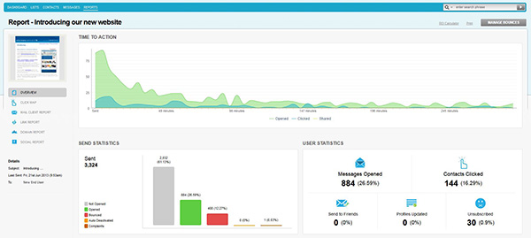
Email marketing has a problem. Our opinion of it is tarnished, both by the companies that overuse it as a marketing device and by the steady feed of spam that we receive on a daily basis, more often than not purporting to be from a bank that we don’t bank with, or from some random offering v1agra!

    This irritable quantity of unwanted emails sculpts our perceptions of email as a digital marketing tool. We tend to overlook the other emails that we get each day, from contacts that we know, or recognise, containing useful information that we selectively skim read, then either file or act on by clicking on, or flag for later consideration when relevant.  Meeting times, statistics, follow-up reports, circulars, newsletter subscriptions, special offers … there are soooo many useful things that we get from emails but when it comes to using them for marketing purposes, a lot of people write them off before giving them a chance.

    So does email marketing work?

    First of all let’s put it in perspective. Ten years ago, running a promotional direct mail campaign (note the lack of an ‘e’ before the word ‘mail’) went something like this:

    1. Prepare the content.

    2. Brief the ad agency who then conceptualise it, design it, edit it and print it once approved.

    3. Merge and export your database.

    4. Get the materials fulfilled, including your reply paid card, and mailing labels printed, peeled and applied.

    5. Lodge it with the mailing house.

    6. Wait (for up to a month for the responses to trickle in).

    7. Pass the leads onto the sales department to follow-up and then tally the number of recipients to measure the results.

    With the above scenario I remember that if we generated a response of more than 2% from the total target list, it was considered successful.

    Fast forward to here and now. If you have a message to communicate:

    1. Prepare the content.

    2. Code it, upload it, email it.

    3. Check back in 3 hours and see how successful it has been.

    Email marketing is simpler to produce, quicker to organise and way more cost effective. Emails get straight to the person they were intended for (most of the time) and are far more responsive than ‘conventional’ media. They are also a fabulous strategic device when considering your other business marketing tools and communication objectives. For example:

    • Regular emailings and beneficial content can quickly hardwire your business web address into your customer’s minds.
    • Hyperlinks leading to previously unexplored parts of your website where useful information is held, help to develop well-worn paths if they keep coming back for more.

    Furthermore the customer statistics are far more detailed and consequently useful. It’s possible to find out who clicked, on what, how many times, who the bought something, who is interested but undecided, and what caught their eye.

    report

    There are also the viral possibilities of your customers forwarding interesting or useful information to their friends and colleagues.

    Ultimately there are the interactive possibilities. Emails allow your customers to email you back which is where the magic happens. Your simple email campaign has suddenly opened up conversations.

    The one BIG disadvantage to email marketing; it’s all over very quickly.

    Conversely the craft and thought that goes into a well-designed print mailshot still means that recipients will spend much more time reading and appreciating the content if it’s relevant. What’s more, when people like something tangible they tend to keep it, usually somewhere prominent like on their desks which can provide days and often weeks of in-their-face branding. This is why we always advise our clients to vary their promotional mechanisms.

    And now the proof.

    Last week we rolled out a new ecommerce website launch announcement on behalf of a client of ours. Within three hours of releasing the emailer, more than 26% of the recipients had read the email and 16% of them had clicked through to the new website. Our client’s web traffic for that day more than doubled and new sales orders were placed too. Bish bash bosh, job done.

    So yes, email marketing works extremely well. It is both efficient and cost-effective too as long as you make it useful to your customers.

  • Posted 17/08/2016 by absolute

    Turn your sales pitch into a knock-out tablet presentation

    presentation

    Tablets are great travelling sales tools and are additionally intriguing when used before live audiences, be it a one-to-one over a coffee, or a one to one-thousand from a podium. As well as being very portable, their hi-resolution displays will make your corporate presentations really pop out of the screen.

    In recent months we’ve designed and published an increasing variety of tablet presentations for use on iPads, Galaxy’s, and other popular devices.  They help our clients to impress their prospects, not just with the content and with their impressive, forward-thinking use of technology, but with a few swipe and pinch gestures thrown in too, to add a bit of drama.

    From our clients’ perspective, iPad’s and tablets provide a consistent backbone for their sales presentations, which is a great way to achieve consistent message delivery when you have a large salesforce. Perhaps more importantly with ever-evolving business structures and product ranges, presentation content updates can also be made when required, rather than having to wait for the next print run of your corporate brochure … at some point in the distant future.

    Probably the handiest aspect of using a tablet as a presentation tool is its scalability. The type of display used can be ‘adapted’ to suit the size of your audience. With one, two or three people, the tablet itself is usually sufficient but, if you are addressing a larger audience, then plugging a video adaptor into the iPad dock connector and connecting the other end to an external display is all that’s required. This can be to a flatscreen TV which most boardrooms are equipped with, or a projector which can of course be scaled to suit much larger audiences.

    Getting the presentation onto your tablet is as simple as copying it into an iTunes library and syncing it, and turning your next sales presentation into an impressive, tablet based slideshow is even easier. Simply call Absolute on 07 3300 6308 and we’ll take it from there.