Absolute Blog

  • Posted 28/11/2017 by Will.N

    What if it did?

    We're sure many of you are familiar with the term SEO and what it stands for. If you’re not - very briefly - Search Engine Optimisation is the process of enhancing a website so that search engines such as Google and Bing list that site on page one of their results when people search using popular terms to find the product or services that a company sells.

    As part of a marketing mix, we have a handful of clients that we provide SEO to on a monthly basis, all of whom have been using us to do so for a minimum of two years, some for as many as five years.

    SEO is of course now a very competitive sector, and whilst investing in getting a page or site to appear on page one is possible, keeping it there is another thing, especially when the businesses you compete with who offer similar services, are also trying to become top Google dog too.

    In our last month’s reports one of our clients had every single one of their terms ranking on page one, sixteen of which were in the top three, and eight of which were in the #1 spot. Not surprisingly their business has grown *significantly * since we started working for them three years ago.

    So if your website is well designed, looks great and gets compliments, but rarely generates any enquiries or phonecalls, then it’s time to ask yourself what if it did? Once you have, call us on 07 3300 6308 and ask, what can absolute do to help?

  • Posted 28/11/2017 by Annie.K

    Trending in web design, right now

    Website design is incredibly fast moving. By experiencing the very latest interface developments on a continuous and evolving basis, visitors will opt to browse elsewhere the instant that a site they’re viewing fails to meet their expectations. To give this claim some relevant context, here are a few of our observations about where it’s at right now, and why:

    Long scrolling pages – started with the goal of getting visitors onto a specific landing page and converting interest into action. Landing pages typically contain sufficient information needed to allow an informed decision and numerous prompts to ‘contact for more info’, ‘sign up for details’, or ‘get in touch NOW’. Often with zero navigation options at the top of the page, they essentially focus the purchase decision to a very clear YES, or a NO.

    Landing pages have evolved into an easy to navigate and anticipatory experience; it’s far easier to swipe your finger up on a mobile phone than it is to locate the menu button, then choose the next page or info that you want to read. Additionally, viewers now typically scroll further and further to see what else is on a page before choosing to move on, and a well-balanced page with excellent content, features and functionality will tease them down, down … and further down.

    Easy navigation – mentioned above but now essential to keeping visitors on your site, smartphones are still considered fiddly for more detailed activities. No one really wants to type a report on one when there’s a real keyboard available, do they? That said, smartphones are now the most used device around the world between the hours of 7am – 10am. Mobile usage now accounts for more than half of the world’s internet browsing traffic and logically, mobile user interfaces need to provide the ability to explore a site quickly and easily. Hence the growth in popularity of longer scrolling pages. But what other implications does this have? How about a less complex navigation menu structure? How about a large clear nav menu that fills the screen rather than running along the top edge of the screen? Why do I have to scroll all the way back to the top of the long scrolling page? That’s right. Sticky menus - which hide when scrolling down, but re-appear when a slight upwards gesture is made - back to the top buttons located in the footer, and responsive hamburger menu buttons are all part of this movement of convenience.

    Making it fast – whether you’ve read this article word for word so far or just skimmed it, you’ll have probably have gathered that the common driving factors behind website design are currently page load speed and ease of use. The reason that website design has moved so rapidly is that the software and hardware technologies supporting it keep evolving at a furious pace.

    PHP is the language that many web servers use when your phone, tablet or PC/Mac requests a web page. Whilst you may not know anything about PHP, what you should know is that PHP7, now active and available for over 12 months, is 20% faster than its predecessor PHP5. Chances are that your website could be performing a lot faster than it currently is, which would make for a better user experience and contribute to better ranking in Google’s search results.

    Fast to complete forms – this one is kinda obvious, but we’re noticing the benefits of it a lot more on websites that have been reviewed to address the problem. It goes without saying that with any online form asking for user information, the more information that you are asked to enter, the less the likelihood that you’ll complete and submit it. This sentiment is further compounded with the use of smaller interfaces which can, as already mentioned, be a bit fiddly at times. Think trying to find the right symbol on a touchscreen keypad whilst you’re rattling along on the commuter train!

    Not surprisingly, the shorter and more straightforward the form – just your name and email address will do – the higher the submission success rate of user details from a page.

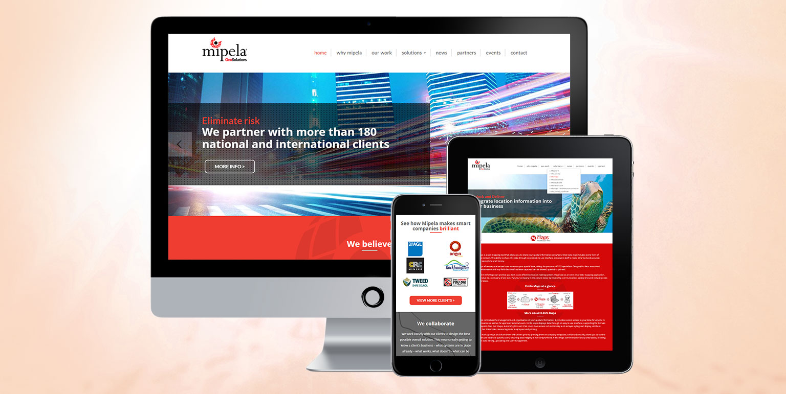
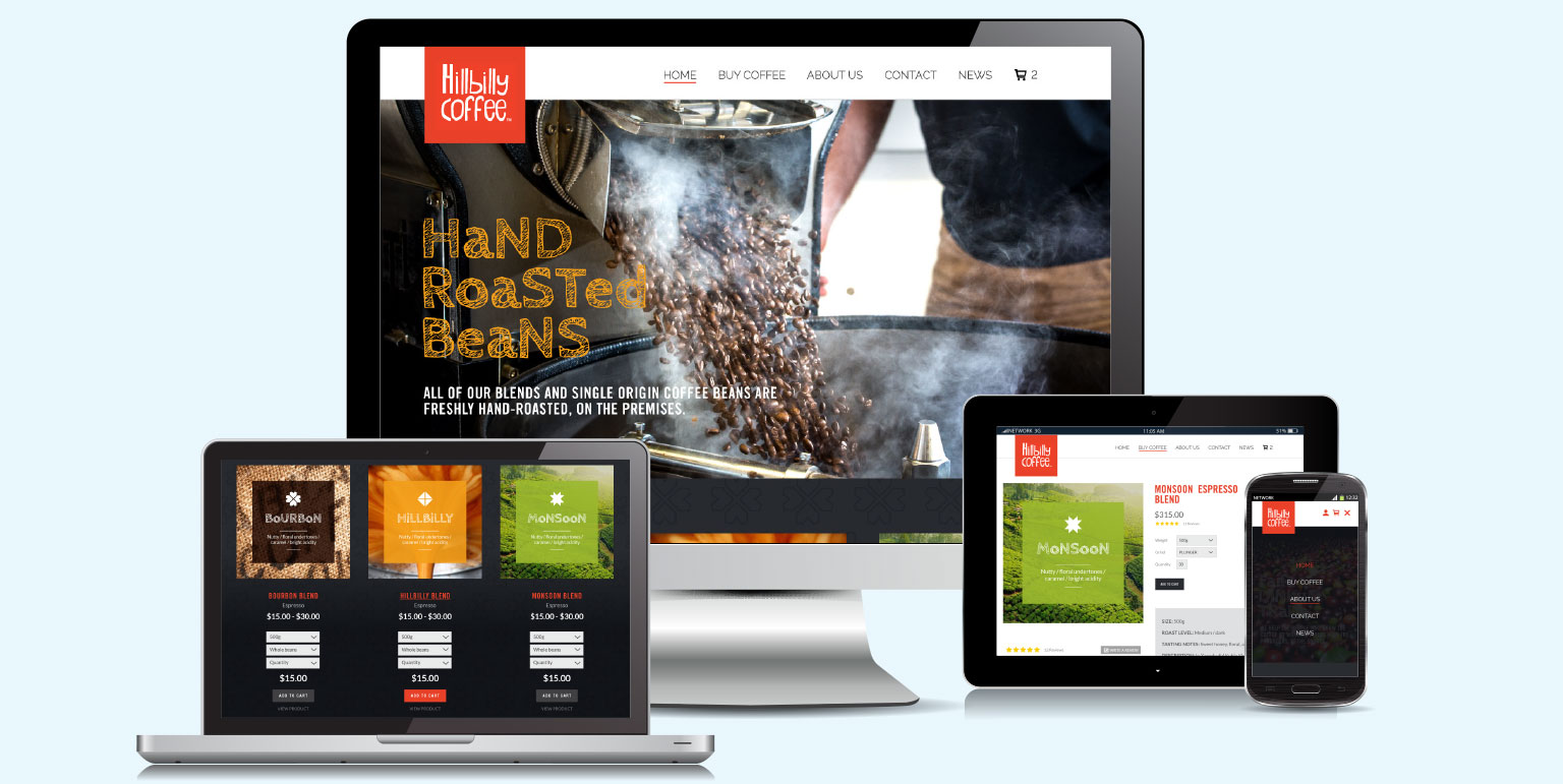
    Mobile responsive – Let’s begin with a confession; we still host a few websites that were designed and coded before tablets were launched and smartphones came to prominence. As you no doubt know, whilst these sites will still display on a smartphone, they aren’t optimised to display on a smartphone, so you will most likely see the whole page on your mobile screen.

    “What does that text say? Can you zoom in? Ah forget it … go back to the search.”

    The discipline of designing a website first for a desktop, then considering how it will look on a mobile device has been turned on its head. Many websites are now designed around the smallest potential viewing platform, for example 1334×750 pixels for a iPhone6, and their design layouts are then adapted to larger screen displays where the content can be flowed to a wider browser window and presented horizontally as well as vertically.

    Also for probably a couple of years now, Google has been penalising websites that aren’t responsive to mobile platforms, so if SEO is important to your business, but you are still running a site that was designed pre-smartphone, then you have quite a battle on your hands.

    Images – a picture saying 1,000 words. We say it in briefing meetings all the time, and in web design it’s truer now than it ever has been. Images bring life to your site, Instagram feeds give it a value of currency, in terms of being live, and the world of web design has seen a move towards less words and more pictures, particularly in combination, especially where the images are relevant to the vision of the business and branding. Ultimately this is being used to better communicate the product or service experience, rather than telling someone about it with lots and lots of words.

    Of course, none of these trends are set in stone and what’s proving popular right now may be a thing of the past in 12 months-time. If there is a monumental shift, we’ll let you know on our blog. And not forgetting, if your website needs a monumental overhaul or just an enquiry form to be streamlined, call us. We look forward to discussing it.

  • Posted 28/11/2017 by Annie.K

    Getting the ‘C’ word in early

    Announcing when we’re NOT going to be here usually invokes a sense of panic!  Marketing and design projects that our clients have been putting off for ages need to be jump-started - pronto! So, whilst it’s definitely early, we are mentally prepared for the challenge and would like to announce our office closure dates this Christmas. Please make a note in your calendars, we will be closing on Friday 22 December at 4pm sharp, and re-opening on Monday 15 January 2018. Should you need a digital, print or marketing project completing before the 22nd, please call us asap.

  • Posted 29/06/2017 by Will.N

    Brochure fold types – a reference guide

    As a graphic design business that specialises in brochure design, one of the conversations that we regularly find ourselves having with clients concerns the form that their printed brochure might take and how it might be folded. Fold types can be very effectively used to gain more interest, to better support the main selling proposition, or to simply sidestep the norm.

    So, to help ourselves as well as to provide a handy reference guide for our clients, we’ve gathered together a selection of the most popular fold types used for printed documents with four, six, eight, ten and sixteen pages as a convenient list for anyone considering sales leaflets, brochures, direct mailers or newsletters.

    The Half-fold, also known as the single fold or book fold, is mainly used for brochures and newsletters, and works well in both landscape and portrait formats. The most common instances are as A4 portrait brochure, opening up to a landscape A3 size, but it can be used at many varied sizes and is still most commonly seen in newspapers.

    The classic Tri-fold, also known as a letter fold, roll fold or c-fold creates a six panel format and presents a great, compact document with good surface areas both inside and out, making it easy to read and fold back together again. These are particularly effective because the three-page centrespread provides a great space with which to communicate your key messages and make serious impact. We often consider ‘the larger the better’ and these work really well at A4 portrait size (when folded), but can be commonly seen at DL size (folded) which opens out to a horizontal A4 sheet of paper. The outside right panel can often be used to great effect too with a sales proposition or conceptual focal point, or by trimming the front cover right edge to reveal some of this page, which sits beneath the cover when folded.

    Roll folds can be also be effectively used for eight, ten or more pages if desired, as can the below z fold. Having more pages enables these types of documents to carry more text or communicating info heavy designs so are perfect for promotional leaflets, programs, tutorials and step by step instruction guides.

    The Z fold, also known as a zig-zag, fan fold or accordion fold is simply a different way of scoring and folding a tri-fold. Instead of folding the third panel in from the right, it’s folded out, making a z shape with the top edge. It is commonly used for flyers, mailouts and brochures, and of course for folding letters so that they fit into a DL envelope.

    Die-cut z fold. Take the flat z fold artwork, cut a horizontal angle from left to right and then fold it together to create a document with an angled front panel which is shorter in height than the middle and back panels. Simple difference, great impact.

    The Gate fold, double fold or window fold format is perfect for graphically-heavy designs. Gate folds also create a six-panel document but, with the two outer panels being narrower than the central panel, the format presents a brilliant way to tee-up then present the message by the reader having to open up the document like a pair of saloon doors.

    Double gatefold brochures constitute four panels, so eight pages. The two ends of the sheet are folded to meet in the middle, and the document is then folded in half again. They are ideal for large presentations and for small format product sales brochures or catalogues with limited but numerous products.

    Double Parallel folded documents have four panels, which creates eight pages. Whilst they may sound confusing, the quite simply consist of an often wide and short flat rectangular sheet, which is first folded in half, and then in half once again in the same direction.

    French folds are made by folding a sheet in half vertically, and then horizontally. The two folds create eight panels, four on the front and four on the back. This enables a document which when folded is the size of a booklet or brochure, which when opened expands to a final size that feels like a poster. This format is most commonly seen with maps and charts, and can be used to great effect with newsletters or for promotional items for where many individual products or events need to be included.

    We hope that you now feel fold-enlightened but if you still have questions about a format that we haven’t explained – think origami – we’re only too happy to help, so drop us a line or call to discuss.

  • Posted 22/06/2017 by Will.N

    Mipela GeoSolutions new website

    Mipela GeoSolutions are a young systems and software design company. In just under ten years they have grown to become one of the premier Location Information Management and GIS companies in Australia.

    With a suite of software products that are designed to help companies be more efficient and productive, they use their product suite to integrate existing business systems, creating workflow automation software solutions, enabling mobile data capture and collection, and introducing service management software solutions.

    Predominantly they deal with the energy and infrastructure sectors to help enable large scale asset management solutions.

    A very smart and IT savvy bunch, they had in recent years designed, produced and maintained their own perfectly coded website, but had concluded that their best use of resource was to focus their developers on customer specific solutions.

    They had already asked Absolute Media to help out with some modifications and updates, but following a competitive pitch, we embarked upon the process of improving their bold online presence, and making it more straightforward for other members of the team to add to the website design by building it on the Wordpress Content Management System platform.

    Our approach in redesigning their site was to create a more professional site whilst deploying their already strong brand which needed honing to promote their status as pioneer in their industry. Introducing a responsive design layout, and making the site much easier to navigate, particular emphasis went into the structure of their product pages and variable support content, with their being lots of media available for some X-Info products, and others having much less to communicate their benefits.