Yet More Important Logo Design Considerations
Logos are generally regarded as artworks which assign a recognisable identity to a business, make it memorable (hopefully for the right reasons) and potentially communicate ideas which add value to the brand.
When approaching the design of a new logo requiring some sort of symbol, device or pictogram, one of the primary strategic considerations that your designer should be making is whether the symbol or device should be literal or conceptual.
Conceptual versus Literal Design
“It’s just a repetition of the name as a nice graphic. So what!?”
 This might sound somewhat psychoanalytical, but often I find my inner monologue rambling to literal logo designs in this way quite a lot. Yeah, it’s a Red Hat. What do they do again? Umm … software. It’s actually a really unstylish red panama hat. Or is it a trilby? What were they thinking when they approved that one?
Perhaps I overthink them a bit too much, but probably not. Because the chances are that your clients will have similar reactions (subconscious or otherwise) about your designs, materials and branding when they are dealing with your business.
In short, a dentist logo doesn’t need to show teeth, a construction firm’s logo doesn’t need to show a building (or a hammer) and a smartphone makers logo doesn’t need to show a smartphone.
It is of course debatable but, to us at Absolute, the primary function of a logo is to say ‘Here we are, remember us.’ Whilst images that are relevant to the business and can perform perfectly well as identifying marks, we find it far more meaningful when a logo design communicates something about ‘who they are’ rather than ‘what they do’.
Humans like to recognise visual patterns and solve puzzles. To most it is far more engaging when the brain is required to make the connection between logo device and business name. We have the innate ability to engage and figure things out, and when we make the association between image and company name, we connect on a deeper level. As well as making the design more memorable, done effectively this can also help to unlock the core qualities of the product or service.
To help illustrate the point, I’ll run with a few examples, the first of which only recently dawned on me.
 The straight-up lettering and the cheeky little smile beneath it are fairly apparent. But, notice where the smile leads from and to, and the small arrowhead at one end? Yes that’s right … Amazon, everything you need, from A to Z.
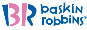
 The Baskin and Robbins logo is a great, high profile example too. Tucked away in the playful ‘BR’ initials are the numbers 3 and 1, referencing the 31 flavours that they are famous for selling.
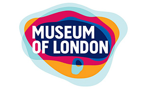
 Perhaps less well known, but a useful example, is the Museum of London logo. At first glance it just looks like some overlapping biological shapes surrounding the text. The colours in-fact represent the changing borders of this famous city throughout its history.
But enough of the reveals. Check out the FedEx logo, have look Cisco’s emblem and, maybe not overly obvious, but see if you can figure out what Hyundai’s logo symbol means … if anything.
One thing is certain; once you make the connection between conceptual design and message by realising what you are looking at, and what it means, it will commit the name and associated values to memory for a much longer than pretty much any literal logo design combo.

